Focus Brands - Research Repository
Project Team: Yi He, Xiuxiu Yuan, Junjie Xu
Aug. 2018 - Dec. 2018
UX Research and Design

Focus Brands is a restaurant conglomerate that owns 7 different brands: Schlotzsky's, Carvel, Cinnabon, Moe's Southwest Grill, McAlister's Deli, Auntie Anne's and Jamba. Each franchise formerly operated independently but Focus Brands has been trying to form inter-brand cohesion in sharing resources and strategy. One of the key aspects of this initiative is sharing market and consumer research through a research repository.
The Problem
Different brands and teams have different processes for gathering, storing and sharing resources. This has led to research being managed through a complicated network of different tools, access levels and human processes that inhibits collaboration. Our goal was to research and design a solution that met the research storing and sharing needs for all teams.


Objective
Understand the existing research collaboration tools and processes as well as user needs and pain points
Explore a few practical solutions and gather user feedback to inform a final design
Propose a solution that best assists users in sharing and maintaining research
Research
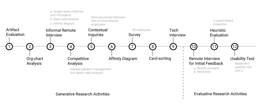
We conducted the following 9 research activities to investigate the current research management system.
MethodS Justification
Artifact Evaluation We analyzed existing research file examples from Focus Brands to get a basic understanding of the current process. This method quickly and cheaply provided us important context.
Org-chart Analysis We analyzed the organizational chart provided by FB to better understand the dynamics between teams and the different stakeholders involved. This helped us to define our target users and stakeholders.
Informal Remote Interview We interviewed the project owners to clearly understand the needs and organizational dynamics. This was a quick way to catch-up on the existing work and to prepare questions for our contextual inquiry.
Competitive Analysis This provided an understanding of the products and features available in the market, so that we could be aware of the options as we researched and designed a solution.
Contextual Inquiry We needed a deeper understanding of the daily needs and paint points for key user groups. This was a time consuming process so we interviewed users that represented a broad spectrum of teams and functions.
Survey We used the findings from our earlier interviews to construct a survey that would give us a broad and statistically valid understanding across all users. This was a cheap but effective way to prioritize design implications.
Card-sorting We chose to use a card sorting activity to understand the different mental models our users employed in sorting and searching for research.
Tech Interview The IT department were important stakeholders because they could shine light on past attempts to solve this issue and provide clarity on the technical constraints a future solution would need to respect.
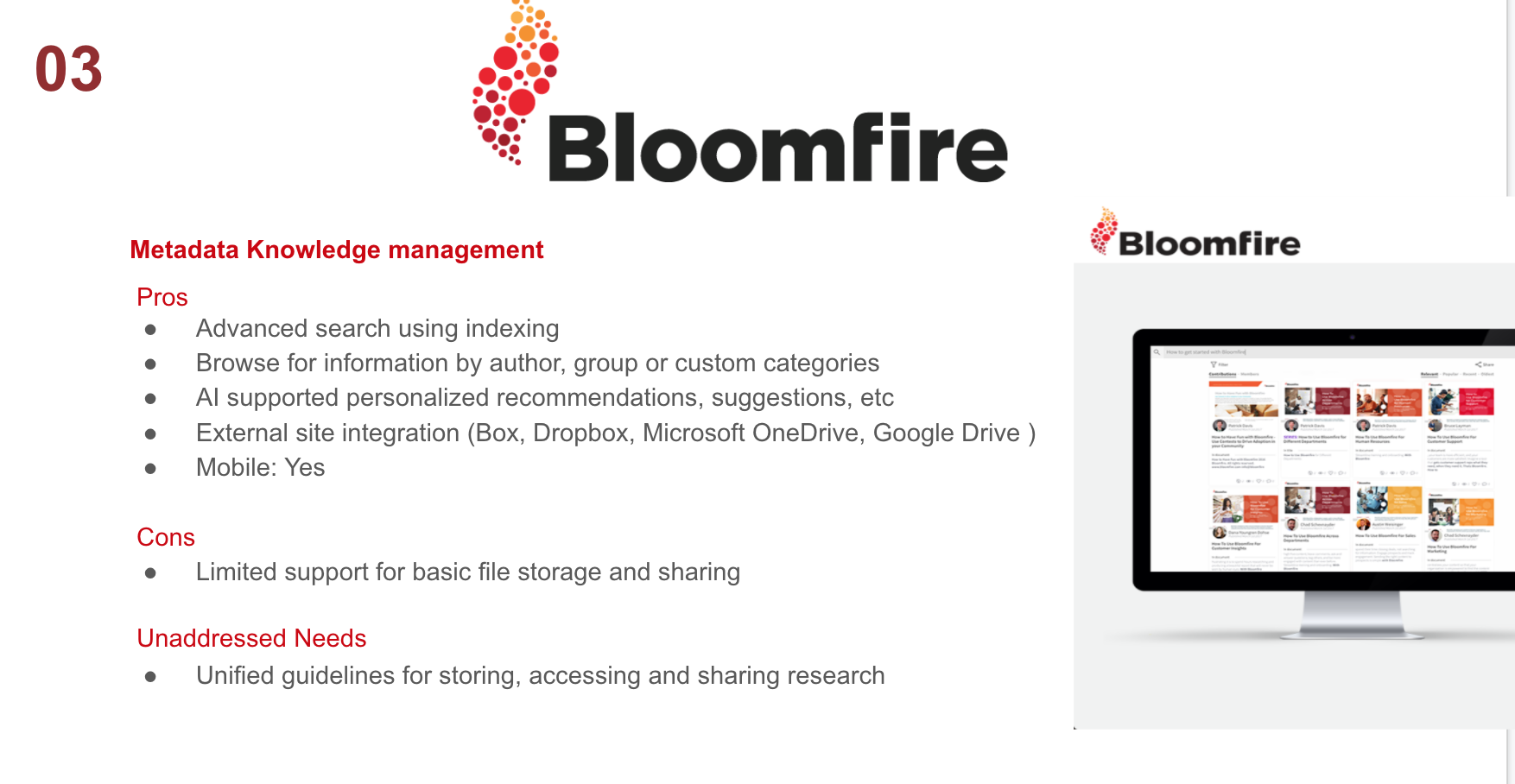
Competitive Analysis
Document management is an issue that is prevalent at all companies so we wanted to understand the types of solutions and some of the ideal tools for each type. The types of solutions fell into the following categories: Knowledge Management, Content Management and Information Retrieval. Top solutions are as follows:


Contextual Inquiry
We conducted six individual interview sessions with employees at Focus Brands Atlanta headquarters on September 25th. We interviewed two growth initiative directors, one marketing director, two brand managers and one social media manager. All interviewers were supported by a note-taker and users audio and screens were recorded for later analysis.

Results and Analysis
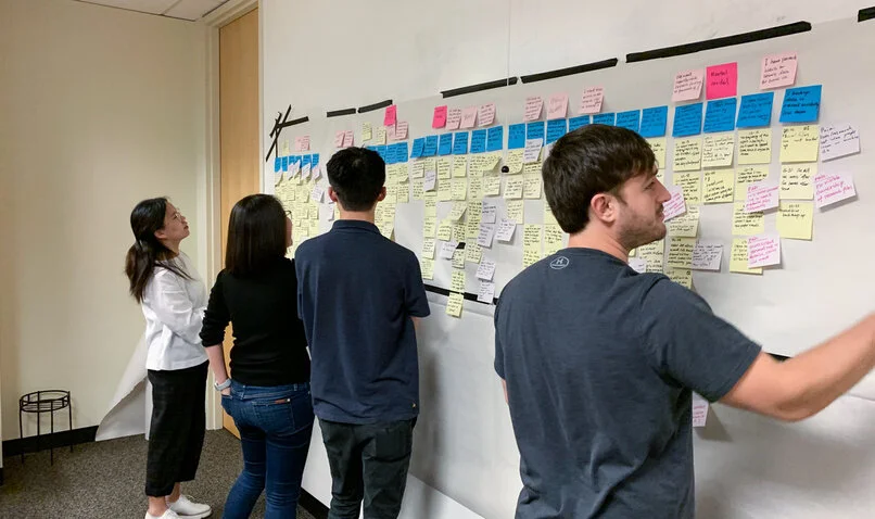
We coded the six recordings (total of 5 hours of video and audio). We analyzed this information in two rounds.
The first round was creating the full diagram. A member read out the content on all stickies and we agreed where to put each one. After arranging and grouping the yellow stickies, we created blue ones to summarize the yellow stickies.
The second round we summarized, rethought and relabeled the blue stickies and grouped and ordered the blue ones with higher level pink stickies.
These high level categories became the summary of our pain-points, user needs and the beginning of our design directions. We validated these findings use the survey.
Initial Findings

Team specific research - Each team has its own needs and process for doing research within their context.
Cross-team research - There was a strong desire to share research between different teams but current barriers make this more difficult.
Existing tools - The current research sharing tools were: Email, a shared network drive, and Sharepoint aren’t designed for and efficient at research sharing.
Guideline and policy - Management doesn’t have a policy for research collaboration and doesn’t publish research guidelines on name conventions, version control and organization.
Locating others’ files - Employees use different methods, often ineffective, to locate others’ research.
Lost files and insights - Ineffective research storing and sharing has led to the loss of files and insights, especially with personnel changes or local files.
Access issues - Requesting access can take a long time and it is not clear who would benefit from each piece of research.
Email is a work-around - Multiple users mentioned they use email to organize and store research for its convenience and efficient searching capabilities.
Shared network drive issues - There is no research management guide or policy at the company to help standardize the network drive use.
Human communication - People often seek guidance or consult with others during the research and decision making process. This exchange happens due to the physical office arrangement with all relevant brands and teams in the Focus Brands building.
Persona and Empathy Map
From our research, we created 4 personas with corresponding empathy maps in order to reflect profiles of Focus Brand stakeholders to guide us in our ideation process.


Core Tasks
Create Add a new document to the research repository
Search Find a document based on partial information
Locate and Access Find a document with a known location
Share Provide another user with the location of a document
Understand the Context Gain relevant information around the genesis, intent, and metadata of a document to understand the potential use for the research
Inform a Decision Use research implications to support a business decision
User Needs
After synthesizing the research findings, we grouped the high-level themes into user needs:

Ideation
The ideation process involved a number of steps. We synthesized the initial findings into an open brainstorming session. We then narrowed and combined our options into our top 3 concepts, which we turned into wireframes. We gathered feedback on these concepts to inform an interactive final high-fidelity prototype.

Brainstorm
We brainstormed 15 ideas of an ideal research repository and voted, then synthesized these into 3 concepts that fit our desired approaches.
Each idea was roughly sketched on paper and then translated into a low-fidelity digital wireframes to make the primary features clear to our target users. The three concepts were:
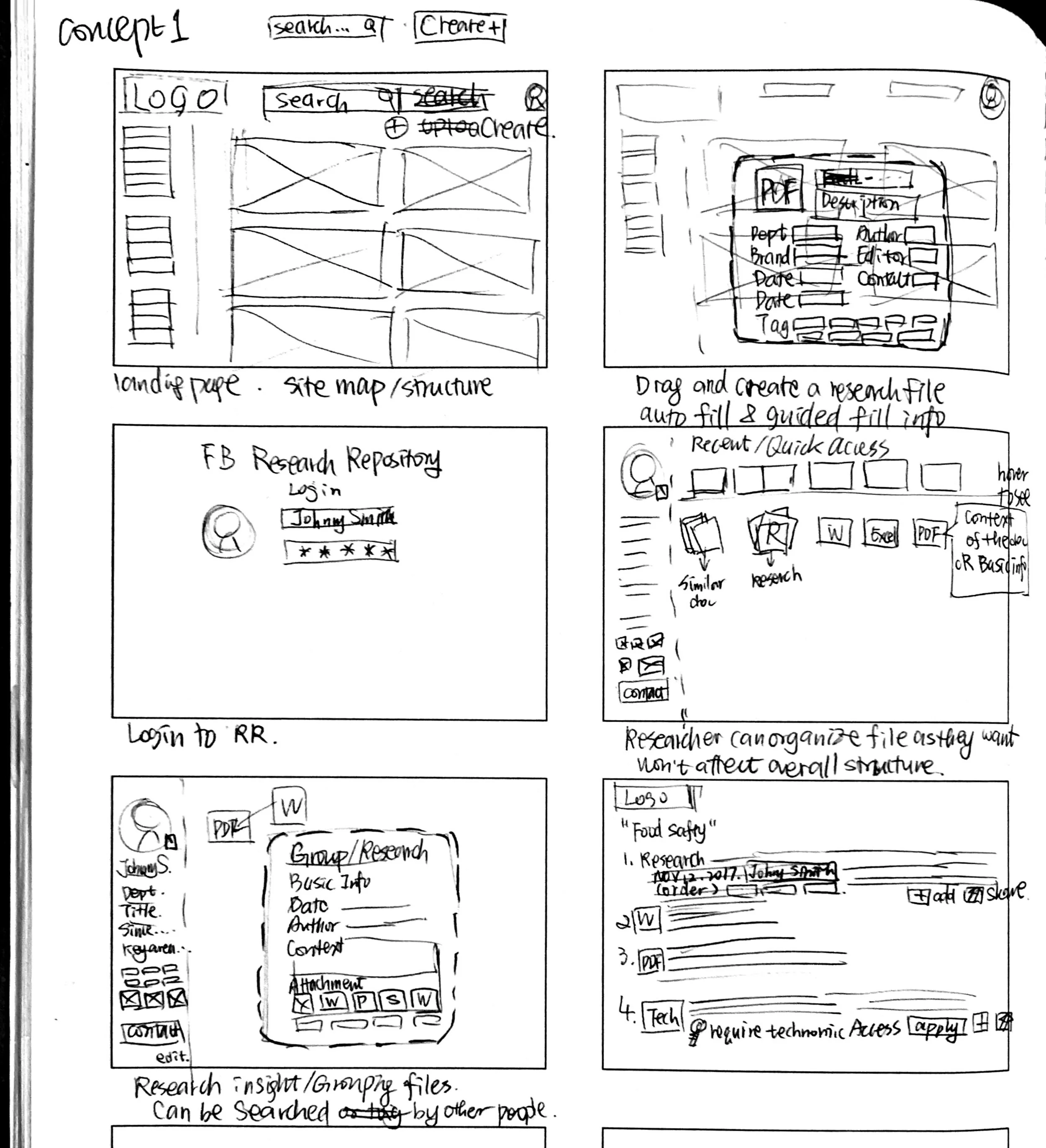
Concept 1 Rigid File System
We designed a web based central research hub that uses a tree structure to help scaffold the file creation, manage and search using a familiar paradigm.
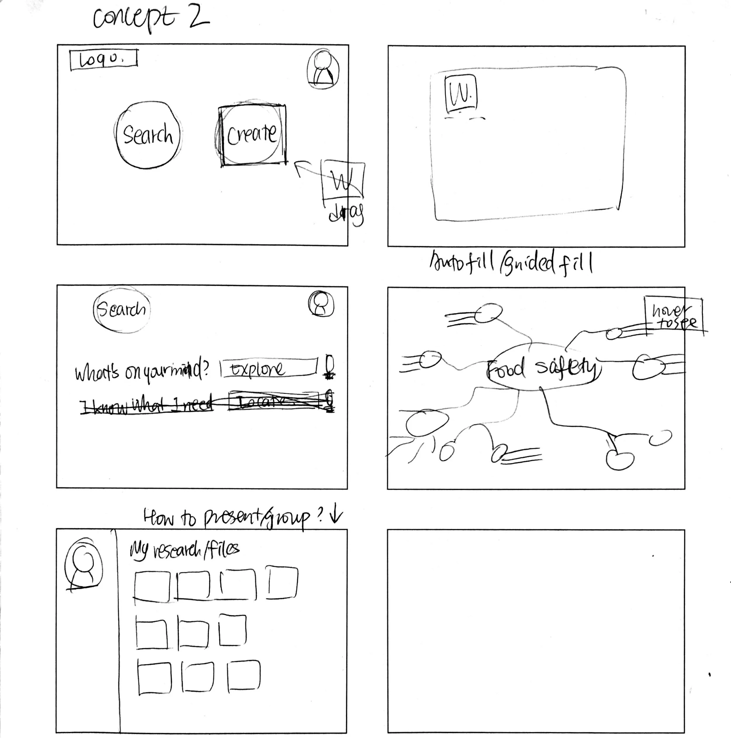
Concept 2 Metadata Categorization and Advanced Visualization
This system used file meta-data to categorize files. Users don’t need to place the file anywhere but need to tag and annotate the file when created.
Concept 3 Board and Notification
This system used a pin-board where files were attached to various personal and team boards with users being notified when files were added or changed on boards they follow.


Feedback
We conducted five, 40 minute remote interview sessions with our target users from Focus Brands. Overall, the participants suggested a strong preference for a central research hub with rigid file creation structure, proposed in concept A. We used the feedback and recommendations generated above to improve our mockups for our expert interview.
We conducted two, 1 hour remote expert evaluations with our industry partner to gain qualitative feedback about the revised concept, key features, general user flow, and basic UI design.
Both sessions provided general feedback about the 3 paradigms but also page-specific improvements.
Design
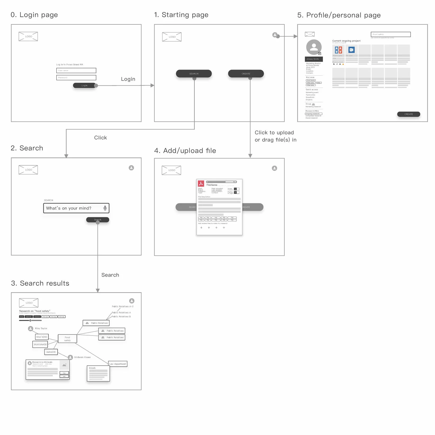
We used the findings to combine the features users preferred into a single interactive prototype built using Sketch and Adobe XD. The main features and changes are summarized below.
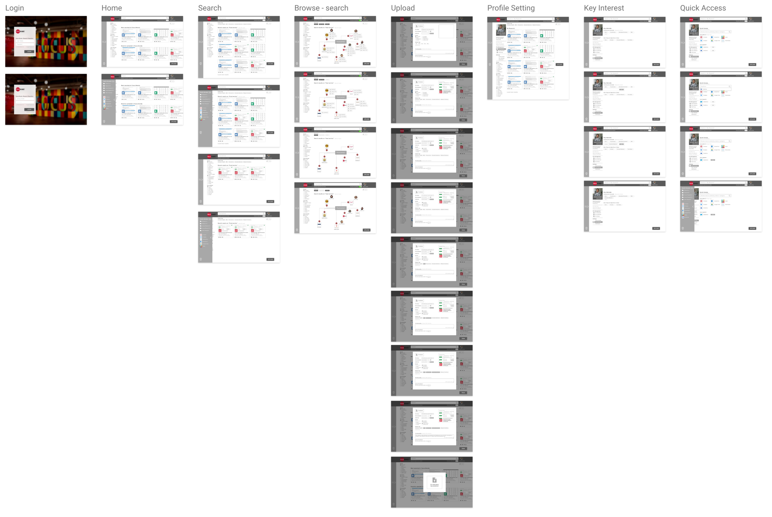
Homepage - Search and Filter
Allow users to search and locate specific files
Support various searching behaviors
Present a smart list of files to users
Allow users to do certain actions with the files

Locating a File
Give users a detailed view of file components of a research project
Provide the research description from the author
Allow collaboration through commenting
Allow users to operate on files: share, save, download

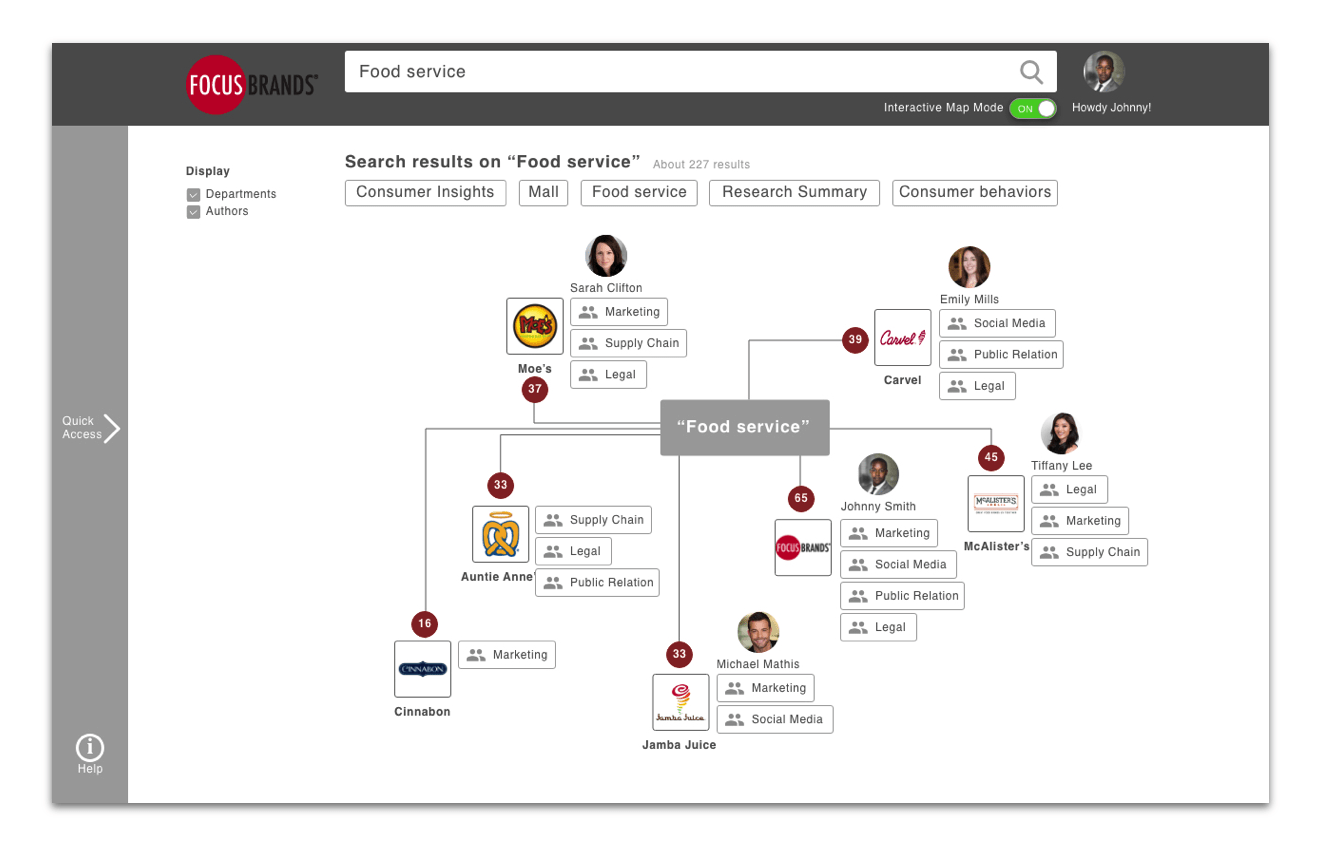
Interactive Map
Allow user to conduct exploratory search
Can toggle between “search view” and the “interactive map view”
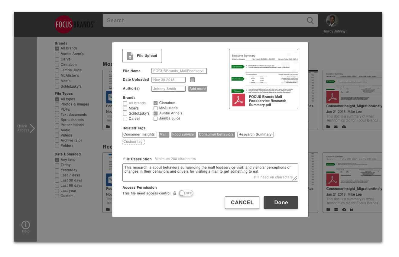
File Creation
Guide user to upload a file in a standard format
Provide a number of categories of meta-data for users to describe and categorize the research
Personal Page
Allow users to set and edit personal profiles
Allow personalized research shortcuts
Allow personal file organization and collection
Manage control over group collaborations and notifications

Evaluation
To test whether the design served its intended purpose, we conducted two evaluative research activities with the interactive prototype. We first conducted an expert heuristic evaluation to quickly gauge the overall system usability; we improved the design based on this feedback. We then conducted in-person user testing to determine whether the design served its intended purpose in the setting of use.
Heuristic Evaluation
We invited 3 UX experts to inspect the whole system based on Nielsen's 10 usability heuristics.
Results - The top 3 violators
Visibility of system status - It is difficult to interpret the effect of some buttons
Recognition rather than recall - Not always clear the correct action with the outcome users expect to achieve
Match between system and the real world - There was confusing text and labels for some functionality
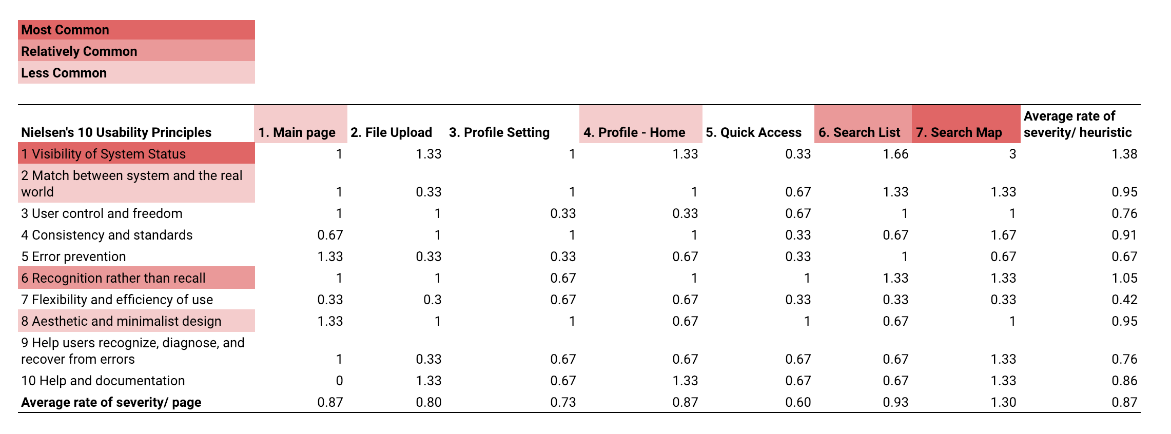
Image: Synthesis of feedback from 3 experts using the Nielsen 10 usability principles
User Testing
We conducted 4 rounds of moderated task-based usability test on Nov 30 with 4 Focus Brands employees at Focus Brands Headquarters in Atlanta. We gave the users 5 tasks and asked them to complete a System Usability Survey (SUS) at the end of testing. Additionally, we gave 7 Likert scale questions for users to rate their satisfaction on the task time, ease of completion and the support information provided.
Tasks
(1) Upload a file Scenario: “Imagine you have a pdf about Mall Foodservice for Cinnabon and Auntie Anne.Try to upload this research file to the repository. Assume you have the file on the desktop.”
(2) Search and Share a file Scenario: “After 2 months, your manager asks for the same document. You forget what it is called but remember the keyword “Food service” and that it is a pdf. After you find the document, tell us how you would share it.”
(3) Browse using the Interactive Map Scenario: “Imagine you are going to work on a Food Service research project. Find the individual brand with the most research on “Food service” using an interactive map and identify who to contact.”
(4) Edit Settings Scenario: “Suppose you join a new team. The team focuses on the “consumer behavior” and you want to add that interest to your profile.”
(5) Add Quick Access Scenario: “Suppose your team started using OneDrive, and you want to add that tool to “Quick Access” for future use. “
Analysis
Task performance results
Task success rate 100%
Average task time:
Task 1: 60s
Task 2: 62s
Task 3: 50s
Task 4: 36s
Task 5: 41s
System usability survey results
Average score (scale 1 - 5)
Overall SUS score: 72.5 - above the threshold 68 for good usability